
RWE’s offshore wind technicians diagnosed turbine faults across 7 steps and 4 disconnected systems (SAP, PDFs, phone calls, tribal knowledge). As the sole UI/UX designer, I designed a unified troubleshooting platform that consolidates this into 3 steps within a single tool — with cross-site fault search, consolidated root cause comparison, and an integrated iPad documentation flow for offshore technicians. Delivered a full design system covering 2 device types and 4 fault scenarios across 2 modules, aligned 11+ stakeholders in 3 review cycles, and handed off a production-ready prototype accepted by engineering.
A global wind fleet with no dedicated troubleshooting tool
When a wind turbine faults offshore, every hour of downtime costs the operator tens of thousands of euros. RWE’s maintenance teams need to diagnose, resolve, and document these faults — often under time pressure and in physically demanding conditions 80km from shore.
The problem: there was no dedicated troubleshooting tool. Teams relied on SAP transaction codes, scattered PDF manuals, and the tribal knowledge of experienced technicians. Information was siloed by site, hard to find, and impossible to standardize across the fleet.
I joined as the sole UI/UX designer on the RWE side, working alongside BCG consultants and internal stakeholders to design a new digital platform from scratch — owning research, IA, prototyping, and handoff across both modules.
What I owned
As the only designer on the RWE side, I was responsible for the full design workstream — from initial research through to production-ready handoff. Here’s the breakdown.
End-to-end design
Research, journey mapping, IA definition, wireframing, prototyping, and interaction specs — continuous from kickoff to handoff.
Design direction for BCG designer
Set design principles, reviewed output against quality standards, and maintained consistency across 2 modules and 15+ screens.
Stakeholder alignment
Facilitated design reviews with 11+ stakeholders across Business Partners, Product Owners, Team Leads, and BCG consultants. Translated business requirements into design decisions.
Research → strategy → execution
Ran the full research arc — ~10 participant interviews, contextual shadowing sessions, journey mapping, and problem framing — then translated findings into a product vision that the entire team could rally around.
Two distinct roles, two different contexts
Through ~10 participant interviews and contextual shadowing sessions across onshore and offshore teams, I identified two primary user profiles with fundamentally different work environments, device contexts, and information needs.
Maintenance Coordinator
/
Lead Technician
Onshore · Control Room ·
Desktop
Keyboard-first search, data-dense tables, multi-monitor support assumption.
Technician
Offshore · Turbine · iPadTouch-first, gloved hands (48px+ tap targets), offline-first, camera-priority workflow.
Mapping the as-is journey revealed deep structural gaps
I conducted contextual shadowing sessions in control rooms, observing maintenance coordinators handle real fault scenarios in real time. I supplemented this with semi-structured interviews across both user groups, focusing on their actual behaviors — not just the official process.
“The most valuable research came from watching, not asking.”
In interviews, participants described the standard process. In shadowing, I saw the workarounds — the sticky notes on monitors, the WhatsApp groups for fault advice, the informal knowledge networks that actually kept operations running.
No dedicated diagnostic tool existed across the entire fleet — teams relied entirely on SAP, PDFs, and personal experience
Per single fault — SCADA, SAP, email, phone, PDF manuals all touched during one resolution
Every fault resolution lived in someone’s head, not a system — no structured capture of institutional knowledge

Four fault scenarios, two product modules
From the research, I synthesized four distinct fault scenarios that technicians encounter. Each requires a different lookup and resolution path — this became the backbone of the product’s information architecture.
Why this framing matters: instead of building a generic tool, we scoped the product around real diagnostic patterns. This let us prioritize the highest-impact path first (known fault at other site) and design progressive disclosure for complex scenarios.
Known fault — own site
The fault has occurred before at this wind farm. The resolution is documented locally — the challenge is finding it quickly.
Known fault — other site Highest impact
Another RWE wind farm has solved this exact fault. But knowledge doesn’t travel between sites — it sits in someone’s head or a local PDF.
Known fault — multiple sites
The fault has been resolved at multiple sites. Consolidating root causes and comparing approaches would save significant diagnosis time.
Unknown fault
A completely new fault with no prior resolution. Requires on-site investigation, hypothesis testing, and thorough documentation for future reference.
Module 1: Troubleshooting
Fault search, root cause lookup across sites, consolidated cause comparison, and work order drafting. Primarily used by the Maintenance Coordinator on desktop.
Module 2: Documentation
Structured capture of repair outcomes, photos, notes, and knowledge transfer. Primarily used by Technicians on iPad while offshore or immediately post-trip.
Navigating a complex stakeholder landscape
A cross-functional environment with competing priorities — BCG consultants focused on operational efficiency, Product Owners concerned with SAP integration timelines, Business Partners representing site-specific needs, and Team Leads managing offshore logistics.
How I managed this: Weekly design review rituals with a rotating set of stakeholders, design decisions framed as hypotheses tied to business metrics, and a shared Mural board as the single source of truth. When priorities conflicted, I grounded the argument in data from shadowing sessions.
How I structured the work
Research & shadowing Week 1–3
Conducted interviews and contextual shadowing sessions with ~10 participants across maintenance coordinators, lead technicians, and offshore technicians. Observed real troubleshooting workflows in control rooms. Synthesized findings into a research report and presented to the full stakeholder group.
As-is journey mapping Week 3–4
Mapped the end-to-end troubleshooting journey across both user roles, covering every location transition — SCADA alarm, control room diagnosis, offshore travel, turbine-level work, and post-trip documentation. Identified critical pain points and information gaps at each stage. Validated with stakeholders in a collaborative Mural workshop.
Vision journey & IA Week 4–6
Defined the target-state journey — where the new tool would intervene. Designed the IA around two modules (Troubleshooting + Documentation) and four fault scenarios. Aligned BCG consultants, Team Leads, and Product Owners on scope. This was the hardest alignment phase — I had to defend the 2-module split against pushback for a single monolithic tool.
Wireframing & prototyping Week 6–10
Designed key screens in Figma: dashboard with fault search, fault results, consolidated root causes, work order drafts, and the technician documentation flow (iPad). Iterated rapidly through 3 rounds of stakeholder feedback, refining interactions and information hierarchy at each pass.
QA & handoff Week 10–12
Quality reviews across 15+ screens for consistency, interaction patterns, and edge cases. Directed the BCG designer’s remaining screens. Final reviews with Business Partners and Product Owners. Delivered a production-ready prototype with interaction specs and annotated handoff documentation.
The redesigned journey — one platform, two modules
The vision journey shows where the new tool plugs in. Instead of context-switching between SAP, PDFs, phone calls, and personal notes, both user roles now follow a streamlined digital workflow within a single platform — with each module optimized for its specific user context.
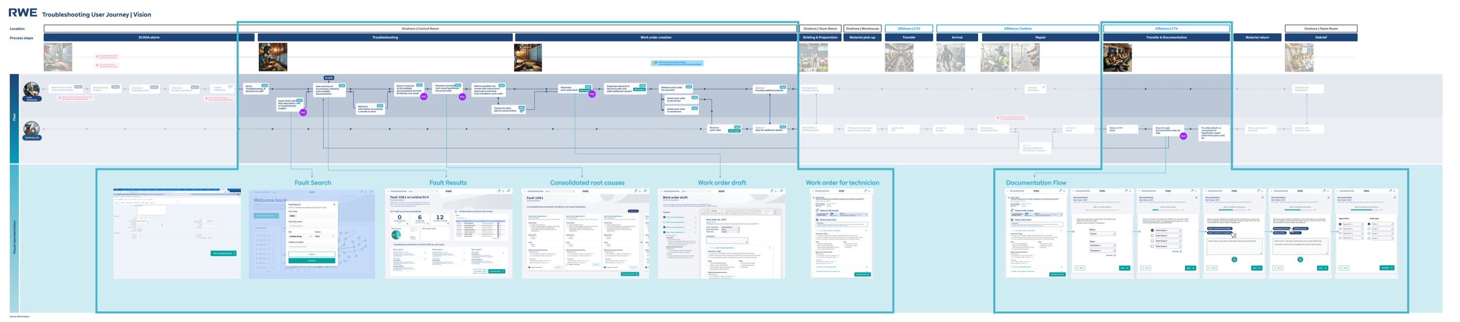
The solution: a structured troubleshooting platform
The final design centers around a searchable fault database, consolidated root cause views, and integrated work order creation — all in one tool. Here are the key screens from Module 1 (Troubleshooting) and Module 2 (Documentation).


Building patterns, not just screens
This project wasn’t a one-off prototype. RWE planned to extend the tool to additional turbine types, new wind farm sites, and potentially onshore wind operations. Every design decision needed to account for that future scale — not just the immediate 3-month scope.
I built a modular component library in Figma that served both modules and both device contexts (desktop + iPad). Here’s how I approached scalability:
Shared component library
Fault cards, status indicators, search patterns, and form elements were designed as reusable components across both modules. New turbine types or fault categories could be added without designing new UI — just new data.
Device-adaptive patterns
Module 1 (desktop) and Module 2 (iPad) share the same data model and interaction grammar, but the UI adapts to context. Large tap targets and photo-first capture for offshore iPad use; dense data tables and keyboard-driven search for the control room.
Edge case handling
What happens when a fault has zero matches? When a technician is offline at sea? When two sites document contradictory root causes? I designed empty states, offline indicators, and conflict resolution flows — not just the happy path.
Why this matters for scalability: The component library and pattern system meant the BCG designer I steered could produce consistent screens faster. It also meant the development team (who received the handoff) had clear, repeatable patterns to implement — reducing the gap between design intent and production output. I documented every component with usage guidelines, not just visual specs.
Designing for harsh environments, not just screens
This wasn’t a typical office SaaS product. One module is used in a control room under time pressure; the other on an iPad offshore, in rain, with gloved hands. Every design decision had to account for the physical reality of the user’s environment.
Touch targets for gloved hands
Module 2 (iPad) uses minimum 48×48px touch targets — 10px above Apple’s guideline. Buttons are spaced with 12px gutters to prevent mis-taps. Photo capture is a single large button, not a small icon. Tested by simulating gloved interaction with thickened fingertips on the prototype.
Color contrast & outdoor visibility
All status indicators use WCAG AA contrast ratios minimum. Critical fault statuses use both color and icon (red + warning triangle) to work for color-blind users. The iPad module uses higher contrast ratios (5.5:1+) because offshore screens compete with direct sunlight and salt spray.
Desktop ↔ iPad responsive logic
Not just responsive breakpoints — a fundamentally different interaction model per device. Module 1 (desktop) prioritizes keyboard-driven search and data density for the control room. Module 2 (iPad) prioritizes one-handed operation, camera-first workflows, and progressive disclosure to reduce cognitive load while on a turbine.
Offline-first architecture
Module 2 works without network by default. All form data saves locally, photos store on-device, and a persistent sync status bar tells the technician exactly what’s uploaded and what’s pending. This wasn’t a graceful degradation — it was the primary design constraint discovered during shadowing.
Three decisions that shaped the product
Every design decision involved trade-offs. Here are three strategic choices I made — and the alternatives I considered before committing.
Cross-site fault search as the entry point
The biggest unlock was making fault resolutions searchable across all RWE wind farms. Previously, a technician at Site A had no way to know that Site B had already solved the exact same fault.
The conceptual reasoning: Navigation-first works when users browse. But in fault resolution, coordinators arrive with a specific SCADA alarm code in hand. They need to go from “I have error code X” to “here’s how other sites resolved it” in one action. A search-first IA mirrors their mental model — they’re not exploring, they’re hunting. The IA needed to match that intent.
AI-ready: I structured the search results UI with relevance scores and confidence indicators — when NLP-based semantic search replaces keyword matching, the interface already supports ranked results with explainability context.
Consolidated root cause comparison
When a fault has been resolved at multiple sites, the tool shows all root causes side-by-side with frequency data. This eliminates one of the biggest time sinks in the as-is workflow — calling colleagues at other sites.
The conceptual reasoning: A flat list puts the cognitive burden on the coordinator — they have to read every resolution and mentally rank them. The consolidated view with frequency counts does that work for them. If 4 out of 5 sites resolved the same fault with “sensor recalibration,” that signal should be visually obvious, not buried in a list. This is about reducing decision-making time under pressure, not just information display.
AI-ready: The frequency counts are the manual version of what becomes probabilistic ranking — “based on fleet-wide data, the most likely root cause is X with 78% confidence.” I designed comparison cards with expandable detail sections to accommodate richer AI metadata.
Integrated work order → documentation loop
Work orders created in Module 1 flow directly into Module 2 as structured documentation templates on the technician’s iPad. This closes the feedback loop: the diagnosis informs the task, and the task outcome feeds back into the knowledge base.
The documentation flow is the flywheel, not a secondary feature. Without structured contributions from technicians, the fault database stays empty. I designed the documentation module to make contributing feel effortless — so the knowledge base would grow organically over time.
The conceptual reasoning: The BCG team initially wanted to treat documentation as a separate backlog item — “ship troubleshooting first, add documentation later.” I pushed back because the tool’s value compounds over time — it only works if the knowledge base grows. I framed this as an operational risk, not a design preference, which is what finally got stakeholder buy-in.
Core insight: Module 2 isn’t a feature — it’s the product strategy. Without the documentation loop, you’re building a search engine with no content.
AI-ready: Module 2’s structured documentation captures fault resolutions in categorised, machine-readable fields — not free-form text. Every resolved fault becomes training data for smarter recommendations.
What I shipped in 12 weeks
Production-ready prototype delivered and accepted by engineering in 3 months — from first stakeholder interview to annotated handoff documentation. Module 1 entered development sprint cycle in Q1 2025. Here’s what I can measure directly:
Fault diagnosis workflow steps reduced — from 4 disconnected systems to 1 unified platform
Full design system covering 2 device types (desktop + iPad) and 4 fault scenarios
Stakeholder review cycles to full alignment (vs. the typical 6+ for cross-functional projects at RWE)
Cross-site knowledge sharing tools before this project: zero. Now: a searchable fleet-wide fault database
Before this project: Each RWE wind farm was an island. Knowledge stayed local, experienced technicians were single points of failure, and fault diagnosis depended on who you knew.
After this project: A single platform connects all sites. Every resolved fault becomes a searchable resource for the entire fleet. New technicians can access institutional knowledge from day one — reducing onboarding risk and operational dependency on senior staff.
What I took from this project
The scope fight that shaped the product
The hardest moment in this project was Week 5, when BCG pushed to merge both modules into a single monolithic tool to “simplify development.” I argued that the two modules serve fundamentally different contexts (desktop control room vs. offshore iPad with gloved hands), and merging them would compromise both. The debate lasted two review cycles. I won it by showing the journey map with physical location transitions highlighted — you can’t use the same UI in a control room and on a turbine nacelle. This taught me that defending a design decision requires evidence, not conviction.
Steering someone’s output requires principles, not preferences
When I first reviewed the BCG designer’s screens, the quality was inconsistent — not because they lacked skill, but because I hadn’t given them clear enough constraints. Saying “make the spacing feel better” doesn’t work across review cycles. I formalized my thinking into documented design principles: “search is always the entry point,” “status information is visible without interaction,” “one primary action per screen.” Once I did that, their output snapped into place.
The technical constraint that improved the design
Offshore iPad connectivity is unreliable — technicians often work with intermittent or no network access. This wasn’t in the original brief; I discovered it during shadowing. It forced a design rethink: Module 2’s documentation flow had to work offline-first, with sync-when-available. This constraint actually made the design better — structured capture fields instead of free-form text, local photo storage before upload, and clear sync status indicators. The best constraints come from real user environments, not product specs.
What I’d do differently — a specific testing plan
We validated through stakeholder reviews and workflow analysis, but I didn’t get prototype-in-hand testing with actual end users until late in the process. If I did this again, here’s the testing plan I’d run:
- 1.Week 3 — First-click test with 3–4 onshore coordinators on a static Figma prototype of the dashboard. Goal: validate that search-first IA matches their mental model. Can run remotely in 20-minute sessions.
- 2.Week 6 — Task completion test with 2–3 coordinators using the interactive prototype. Three tasks: search a fault code, compare root causes, draft a work order. Measure completion rate and time-on-task.
- 3.Week 9 — Contextual walkthrough of Module 2 with 1–2 technicians on-site or via video call with screen share to an iPad. Test the documentation flow with gloved-hand simulation and offline scenario.
The logistics of offshore access made this genuinely hard — technicians are on rotating schedules and travel to turbines days in advance. But I should have prioritized the remote coordinator tests (steps 1–2), which had no logistical barrier. I’d also invest more upfront in the component library, because the speed gains would have compounded through prototyping.
This project is a knowledge retrieval system at its core — and that’s exactly where AI creates the most impact. Each of the three design decisions above was shaped by awareness of where intelligent features would eventually plug in: semantic search for Decision A, probabilistic ranking for Decision B, and structured training data for Decision C. The details are woven into each decision’s reasoning above.